Creative challenges
Logistella project
Our client is a logistics company “Logistella” that had only a name and trusted us to create their visual identity.
Creativity expands
The Process
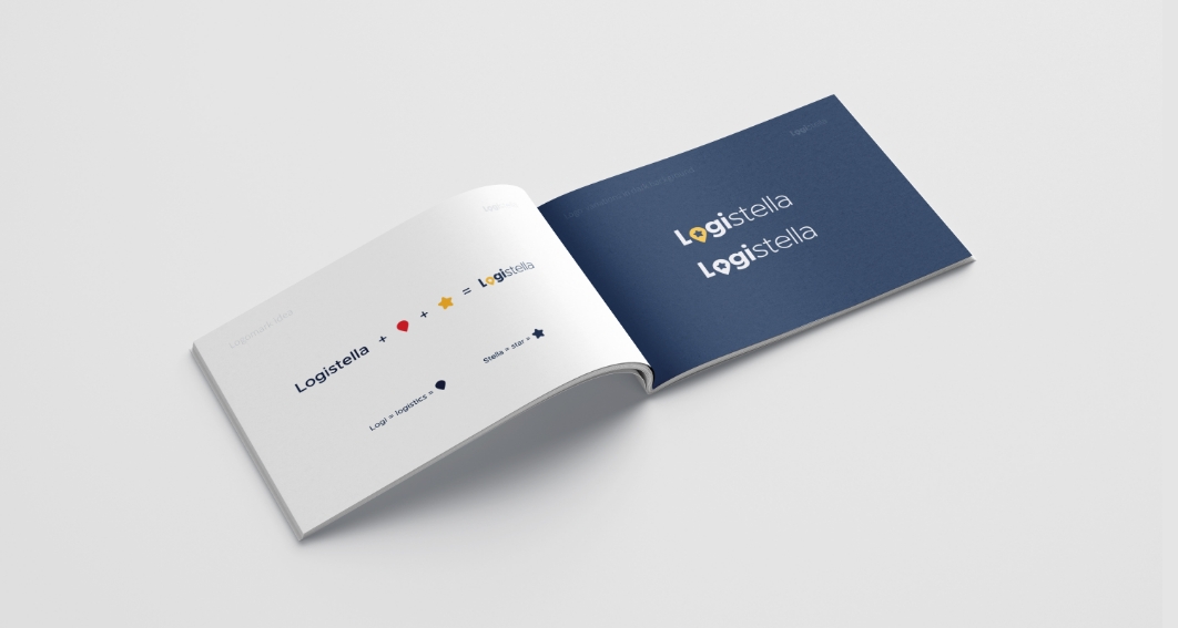
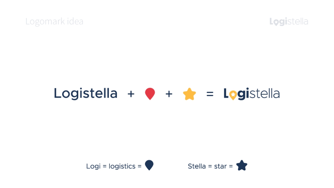
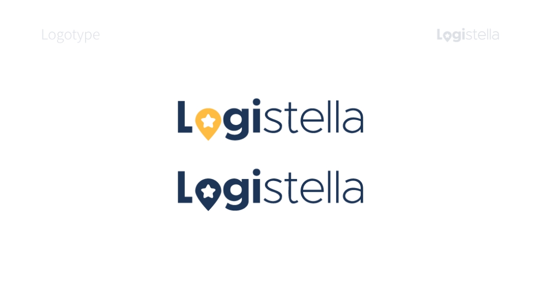
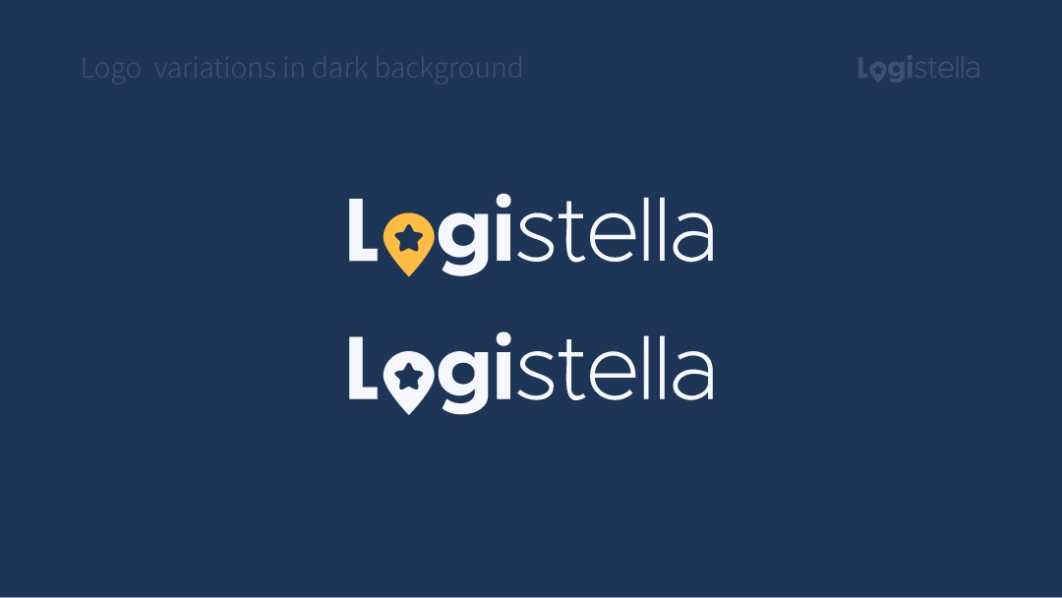
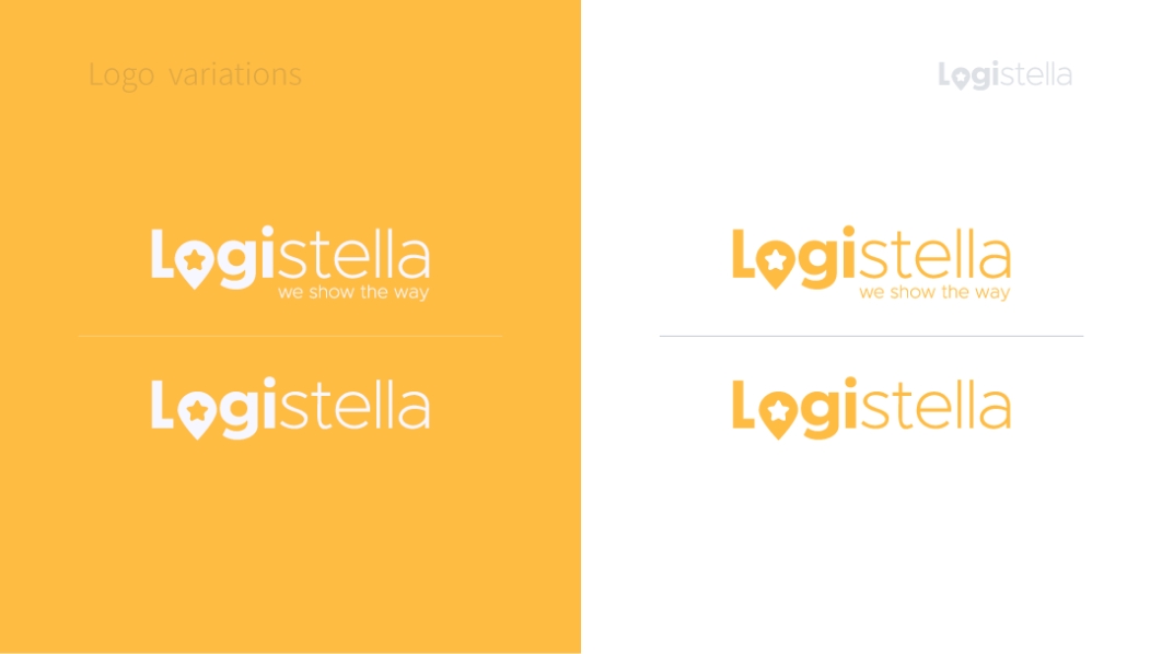
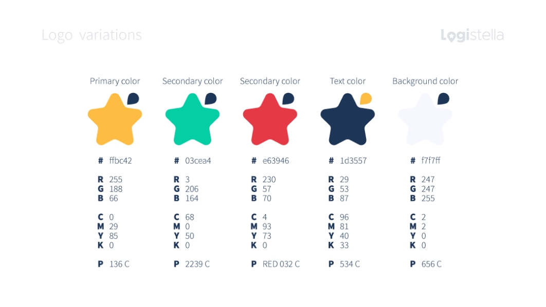
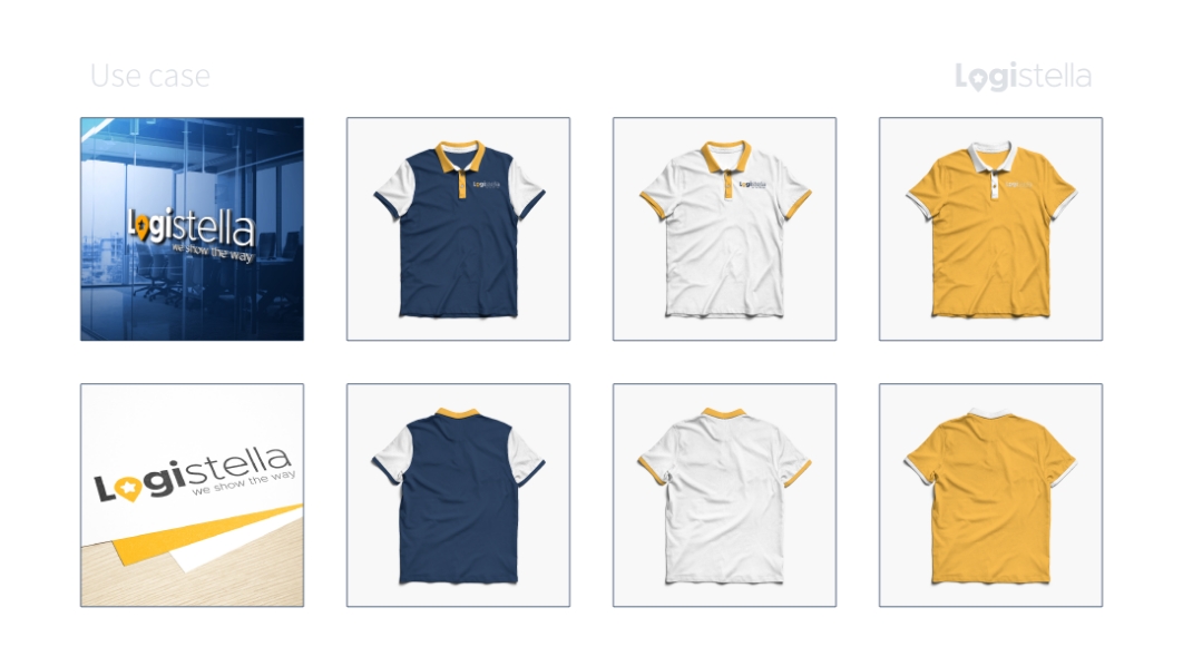
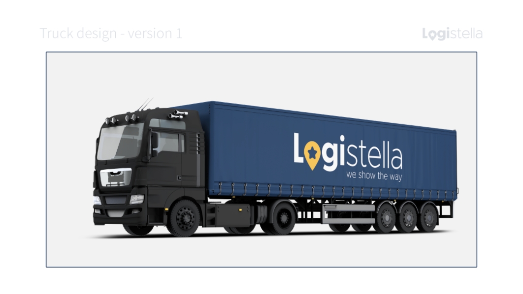
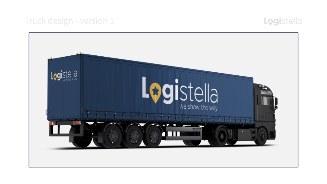
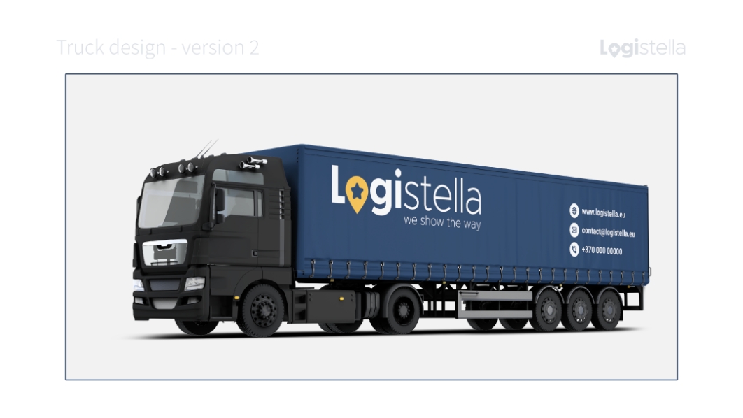
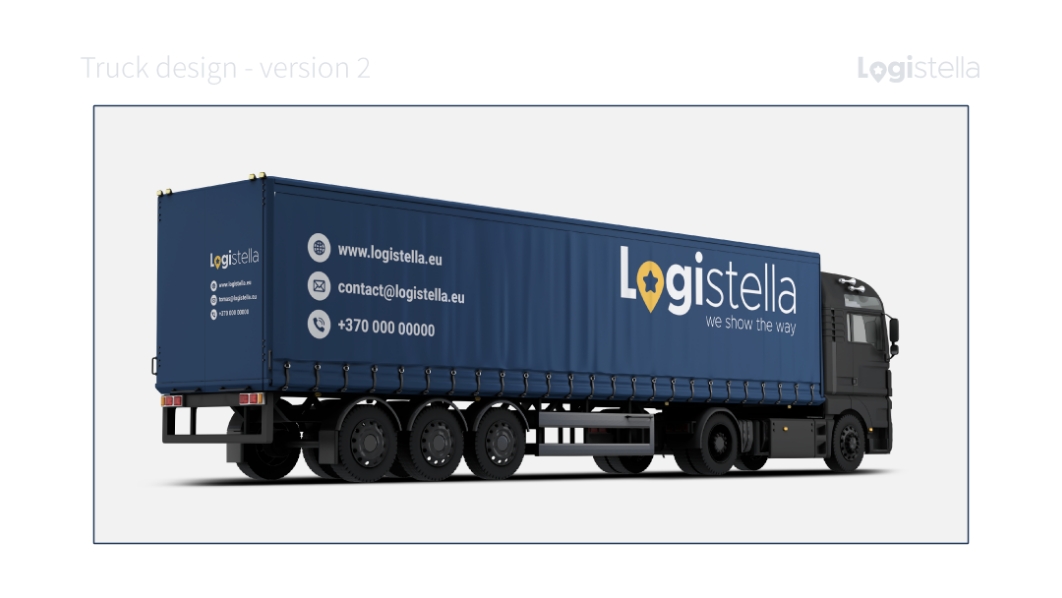
We started with picking two main colors for the brand: blue, which represents the company’s machinery as well as duty and seriousness, and yellow, which represents a star, showing the way to brighten the road, as well as the tagline “we show the way.” Logi – logistics + Stella – star = Logistella is a logo use symbol that matches the word. When the brand name is not uttered, the symbol assists in identifying the brand.

A spectrum of options
Service offers